Activity
Activity helps BNZ customers understand their spending behaviour and take more intentional action with their money.
Role: Product Designer
Scope: End-to-end design of a core personal finance experience, from concept through launch and iteration, in close partnership with product, research and engineering.
Impact:
- +23 minutes average increase in in-app session time, signaling deeper engagement with financial insights
- Improved users’ sense of control and confidence by making financial activity transparent and easy to interpret
- Drove strong adoption among 18–35 year olds, supporting behaviour change from spending to saving
- Received consistently positive customer feedback and won Bronze at the NZ Best Design Awards
View case study


Overview
Many customers could see transactions, but struggled to recognise patterns, track progress, or know where to start. Activity reframed raw financial data into a clear, human readable view of spending over time.
I led the end-to-end product design across four release cycles, partnering with product, research and engineering to shape both the experience and underlying interaction model.
The feature increased session engagement by 23 minutes and became a foundation for future behaviour-driven financial tools.
The problem we were solving
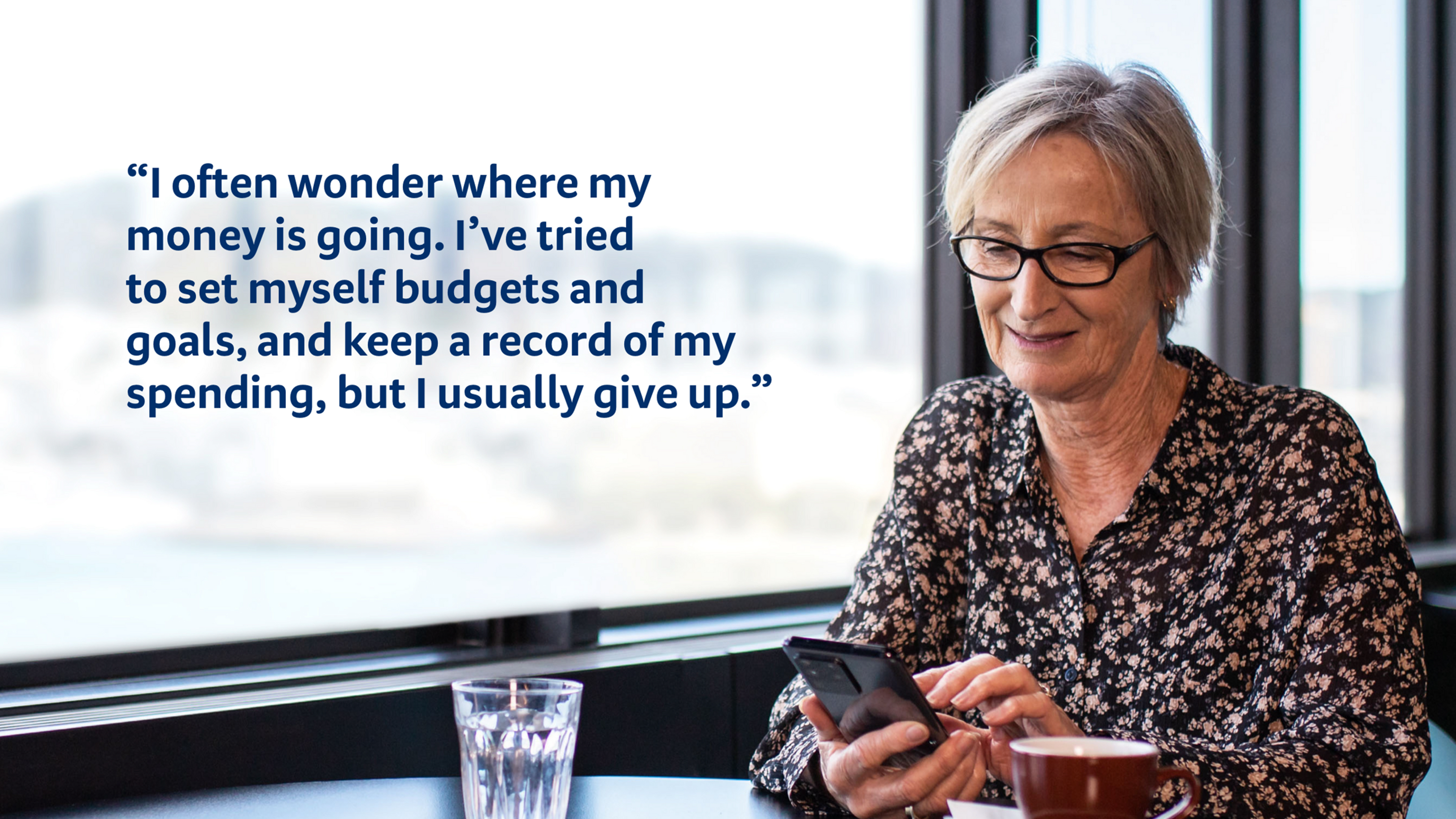
Many New Zealanders want to be better with money, but lack confidence, clarity or a starting point.
Across discovery, we consistently heard:
- Feel guilt around spending
- Feel uncertain about whether they were “doing okay”
- Struggle to translate intent (“I want to save”) into action
The challenge wasn’t access to data, but turning transactions into understanding, and understanding into behaviour change.
Who this was for?
We focused on two core customer mindsets:
The Sieve
Lower financial confidence, overwhelmed by where money goes.
The Futurist
Baseline literacy, motivated by progress and long-term planning.
Designing for both required balancing clarity without oversimplification, and insight without overload.
My role and influence
I was the Product Designer responsible for shaping Activity from discovery through delivery, with a focus on decision making and trade-offs in a sensitive financial context.
- Partnered with research to translate insights into design direction
- Led problem and solution discovery across qualitative and quantitative inputs
- Defined interaction models and visual hierarchy
- Made deliberate trade-offs to reduce cognitive and emotional load
- Supported delivery across four incremental releases
Key constraints and trade-offs
- Banking data is emotionally charged and highly regulated
- Customers had widely varying financial literacy
- Over-explaining risked overwhelming, under-explaining risked trust
- We needed to ship value incrementally
A recurring trade-off was deciding how much insight was helpful without becoming confronting or discouraging.
Design approach
Rather than building a traditional “financial dashboard,” we focused on progressive clarity, surfacing the right insight at the right moment.
Core insight
- Customers didn’t want more numbers. They wanted to know:
- Am I doing better or worse than before?
- Where should I focus to make the biggest change?
- Am I moving forward?
This shaped two core experiences.
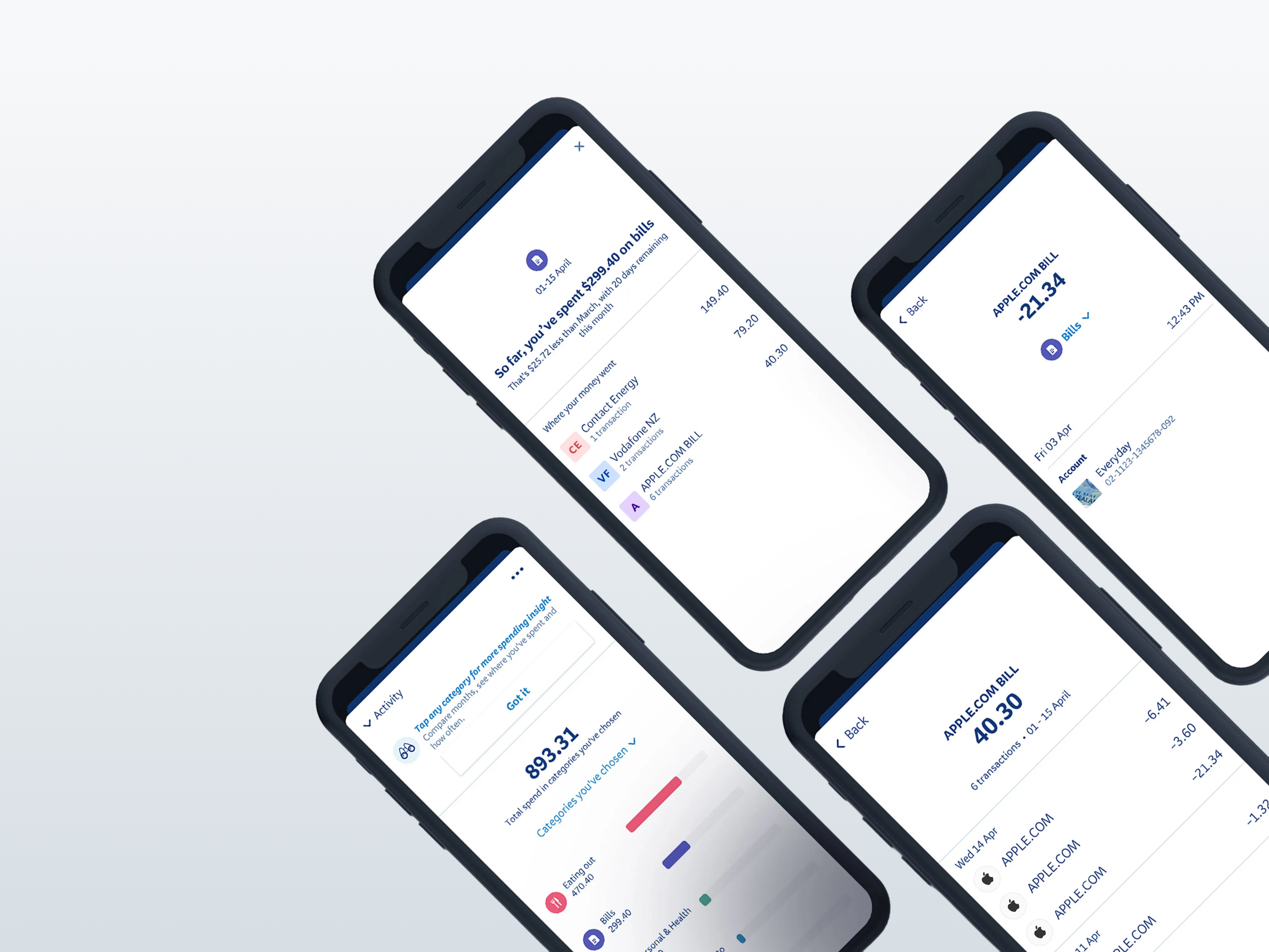
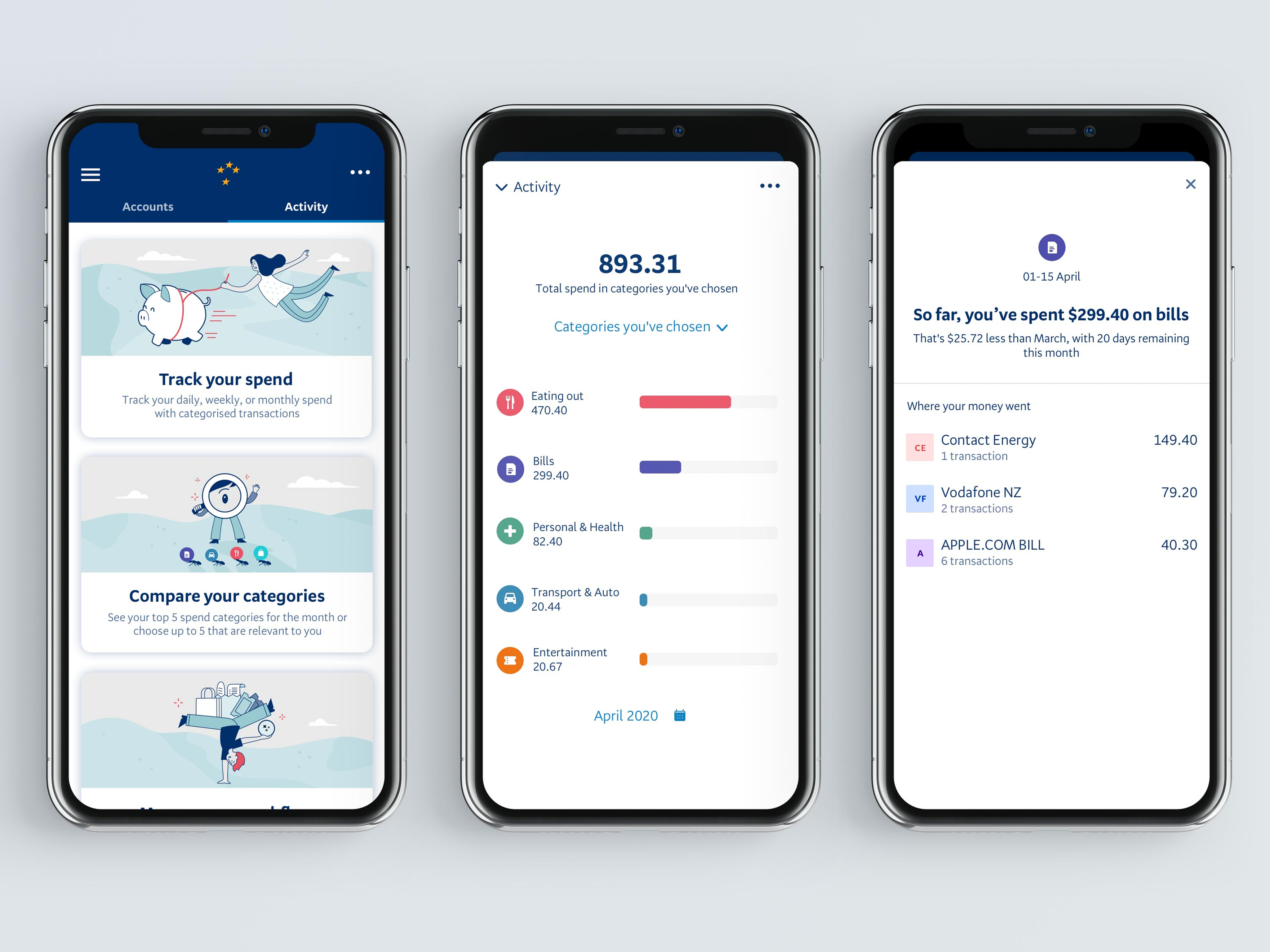
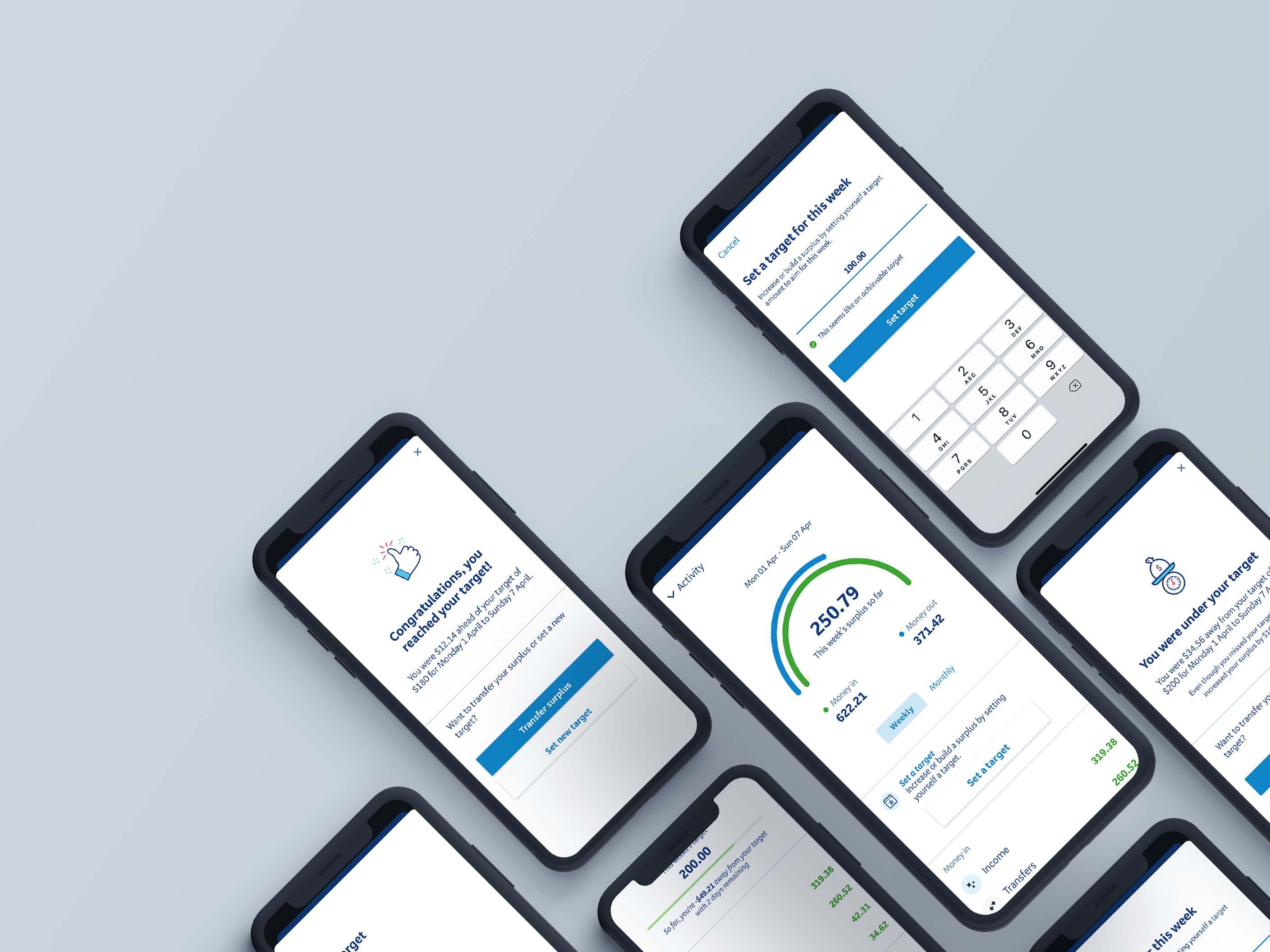
Category comparison
Decision: Show relative change, not just totals.
We explored multiple ways of presenting category data, then deliberately simplified the interaction to a tap-on-bar model that surfaced:
- Plain-language comparisons
- Top merchants and transaction counts
- Directional trends over time
Redundant details already available elsewhere in the app were removed to keep the experience lightweight and scannable.
Result
Customers could quickly identify where change would actually matter, filtering out non-negotiables like rent.
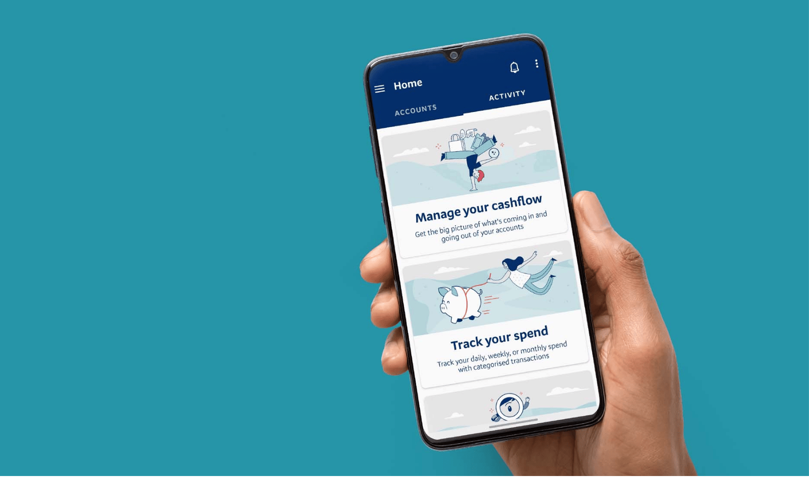
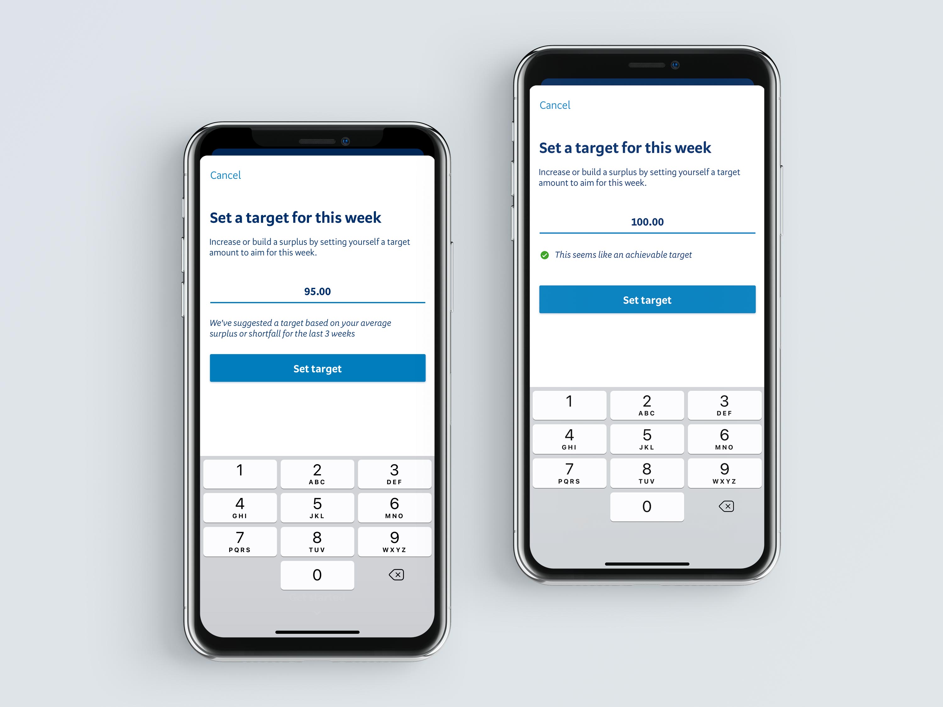
Manage your cashflow
Decision: Lead with surplus or shortfall, not line items.
Through testing, we learned that knowing whether you’re ahead or behind mattered more than seeing every number.
The final model led with:
- A clear surplus/shortfall summary
- Categorised income and expenses for context
- Optional targets that supported action without pressure
Some ideas (like custom payday logic) tested well but were deferred due to scope and documented as future opportunities.
ResultThe final experience made it easy for customers to see whether they were ahead or behind at a glance, with deeper context available only when it was needed.
Outcomes
Customer
- Increased sense of control and financial confidence
- Clearer understanding of spending behaviour
- Customers described feeling like they were “winning” when progress was visible
Product impact
- Increased in-session app time
- Strong adoption among customers aged 18–35
- Most commonly used during reflective moments (Sunday evenings)
Recognition
- Bronze — NZ Best Design Awards

What this work unlocked
Activity shifted the product from showing what customers spent to helping them understand why it mattered and what to do next.
It established a foundation for future insights, goal-setting, and behaviour-driven features, showing that financial products can be both clear and supportive.
Reflection
Looking back, this project strengthened my ability to focus on craft, surface trade-offs early and partner more effectively with product and design leadership to help shape direction.
View more:


Activity
Activity helps BNZ customers understand their spending behaviour and take more intentional action with their money.
Role: Product Designer
Scope: End-to-end design of a core personal finance experience, from concept through launch and iteration, in close partnership with product, research and engineering.
Impact:
- +23 minutes average increase in in-app session time, signaling deeper engagement with financial insights
- Improved users’ sense of control and confidence by making financial activity transparent and easy to interpret
- Drove strong adoption among 18–35 year olds, supporting behaviour change from spending to saving
- Received consistently positive customer feedback and won Bronze at the NZ Best Design Awards
View case study
Overview
Many customers could see transactions, but struggled to recognise patterns, track progress, or know where to start. Activity reframed raw financial data into a clear, human readable view of spending over time.
I led the end-to-end product design across four release cycles, partnering with product, research and engineering to shape both the experience and underlying interaction model.
The feature increased session engagement by 23 minutes and became a foundation for future behaviour-driven financial tools.
The problem we were solving
Many New Zealanders want to be better with money, but lack confidence, clarity or a starting point.
Across discovery, we consistently heard:
- Feel guilt around spending
- Feel uncertain about whether they were “doing okay”
- Struggle to translate intent (“I want to save”) into action
The challenge wasn’t access to data, but turning transactions into understanding, and understanding into behaviour change.
Who this was for?
We focused on two core customer mindsets:
The Sieve
Lower financial confidence, overwhelmed by where money goes.
The Futurist
Baseline literacy, motivated by progress and long-term planning.
Designing for both required balancing clarity without oversimplification, and insight without overload.
My role and influence
I was the Product Designer responsible for shaping Activity from discovery through delivery, with a focus on decision making and trade-offs in a sensitive financial context.
- Partnered with research to translate insights into design direction
- Led problem and solution discovery across qualitative and quantitative inputs
- Defined interaction models and visual hierarchy
- Made deliberate trade-offs to reduce cognitive and emotional load
- Supported delivery across four incremental releases
Key constraints and trade-offs
- Banking data is emotionally charged and highly regulated
- Customers had widely varying financial literacy
- Over-explaining risked overwhelming, under-explaining risked trust
- We needed to ship value incrementally
A recurring trade-off was deciding how much insight was helpful without becoming confronting or discouraging.
Design approach
Rather than building a traditional “financial dashboard,” we focused on progressive clarity, surfacing the right insight at the right moment.
Core insight
- Customers didn’t want more numbers. They wanted to know:
- Am I doing better or worse than before?
- Where should I focus to make the biggest change?
- Am I moving forward?
This shaped two core experiences.
Category comparison
Decision: Show relative change, not just totals.
We explored multiple ways of presenting category data, then deliberately simplified the interaction to a tap-on-bar model that surfaced:
- Plain-language comparisons
- Top merchants and transaction counts
- Directional trends over time
Redundant details already available elsewhere in the app were removed to keep the experience lightweight and scannable.
Result
Customers could quickly identify where change would actually matter, filtering out non-negotiables like rent.
Manage your cashflow
Decision: Lead with surplus or shortfall, not line items.
Through testing, we learned that knowing whether you’re ahead or behind mattered more than seeing every number.
The final model led with:
- A clear surplus/shortfall summary
- Categorised income and expenses for context
- Optional targets that supported action without pressure
Some ideas (like custom payday logic) tested well but were deferred due to scope and documented as future opportunities.
ResultThe final experience made it easy for customers to see whether they were ahead or behind at a glance, with deeper context available only when it was needed.
Outcomes
Customer
- Increased sense of control and financial confidence
- Clearer understanding of spending behaviour
- Customers described feeling like they were “winning” when progress was visible
Product impact
- Increased in-session app time
- Strong adoption among customers aged 18–35
- Most commonly used during reflective moments (Sunday evenings)
Recognition
- Bronze — NZ Best Design Awards
What this work unlocked
Activity shifted the product from showing what customers spent to helping them understand why it mattered and what to do next.
It established a foundation for future insights, goal-setting, and behaviour-driven features, showing that financial products can be both clear and supportive.
Reflection
Looking back, this project strengthened my ability to focus on craft, surface trade-offs early and partner more effectively with product and design leadership to help shape direction.
View more:

Activity
Activity helps BNZ customers understand their spending behaviour and take more intentional action with their money.
Role: Product Designer
Scope: End-to-end design of a core personal finance experience, from concept through launch and iteration, in close partnership with product, research and engineering.
Impact:
- Increase in average in-app session time, signalling deeper engagement with financial insights
- Increased customer confidence by making spending behaviour transparent and easy to interpret
- Strong adoption among the 18–35 age group, supporting behaviour change from awareness to action
- Bronze, NZ Best Design Awards
View case study
Overview
Many customers could see transactions, but struggled to recognise patterns, track progress, or know where to start. Activity reframed raw financial data into a clear, human readable view of spending over time.
I led the end-to-end product design across four release cycles, partnering with product, research and engineering to shape both the experience and underlying interaction model.
The feature increased session engagement by 23 minutes and became a foundation for future behaviour-driven financial tools.
The problem we were solving
Many New Zealanders want to be better with money, but lack confidence, clarity or a starting point.
Across discovery, we consistently heard:
- Feel guilt around spending
- Feel uncertain about whether they were “doing okay”
- Struggle to translate intent (“I want to save”) into action
The challenge wasn’t access to data, but turning transactions into understanding, and understanding into behaviour change.
Who this was for?
We focused on two core customer mindsets:
The Sieve
Lower financial confidence, overwhelmed by where money goes.
The Futurist
Baseline literacy, motivated by progress and long-term planning.
Designing for both required balancing clarity without oversimplification, and insight without overload.
My role and influence
I was the Product Designer responsible for shaping Activity from discovery through delivery, with a focus on decision making and trade-offs in a sensitive financial context.
- Partnered with research to translate insights into design direction
- Led problem and solution discovery across qualitative and quantitative inputs
- Defined interaction models and visual hierarchy
- Made deliberate trade-offs to reduce cognitive and emotional load
- Supported delivery across four incremental releases
Key constraints and trade-offs
- Banking data is emotionally charged and highly regulated
- Customers had widely varying financial literacy
- Over-explaining risked overwhelming, under-explaining risked trust
- We needed to ship value incrementally
A recurring trade-off was deciding how much insight was helpful without becoming confronting or discouraging.
Design approach
Rather than building a traditional “financial dashboard,” we focused on progressive clarity, surfacing the right insight at the right moment.
Core insight
- Customers didn’t want more numbers. They wanted to know:
- Am I doing better or worse than before?
- Where should I focus to make the biggest change?
- Am I moving forward?
This shaped two core experiences.
Category comparison
Decision: Show relative change, not just totals.
We explored multiple ways of presenting category data, then deliberately simplified the interaction to a tap-on-bar model that surfaced:
- Plain-language comparisons
- Top merchants and transaction counts
- Directional trends over time
Redundant details already available elsewhere in the app were removed to keep the experience lightweight and scannable.
Result
Customers could quickly identify where change would actually matter, filtering out non-negotiables like rent.
Manage your cashflow
Decision: Lead with surplus or shortfall, not line items.
Through testing, we learned that knowing whether you’re ahead or behind mattered more than seeing every number.
The final model led with:
- A clear surplus/shortfall summary
- Categorised income and expenses for context
- Optional targets that supported action without pressure
Some ideas (like custom payday logic) tested well but were deferred due to scope and documented as future opportunities.
ResultThe final experience made it easy for customers to see whether they were ahead or behind at a glance, with deeper context available only when it was needed.
Outcomes
Customer
- Increased sense of control and financial confidence
- Clearer understanding of spending behaviour
- Customers described feeling like they were “winning” when progress was visible
Product impact
- Increased in-session app time
- Strong adoption among customers aged 18–35
- Most commonly used during reflective moments (Sunday evenings)
Recognition
- Bronze — NZ Best Design Awards
What this work unlocked
Activity shifted the product from showing what customers spent to helping them understand why it mattered and what to do next.
It established a foundation for future insights, goal-setting, and behaviour-driven features, showing that financial products can be both clear and supportive.
Reflection
Looking back, this project strengthened my ability to focus on craft, surface trade-offs early and partner more effectively with product and design leadership to help shape direction.
View more:
